# Install the required packages

#install.packages("zyp")
#install.packages("terra")
#install.packages("spatialEco")

# Load required packages

library(spatialEco)
library(terra)Analyzing trends in time series maps using R
Objectives
The general objective of this session is to analyze trends in yearly maps that show the mean photosynthetic activity (NDVI) of Sierra Nevada vegetation cover from 2011 to 2020 using R.
R workflow
We will compute Mann-Kendall time series analysis on NDVI mean yearly maps.
First, you will need to download the yearly NDVI rasters from this folder.
Install and load the required packages:
- Create a multiband terra SpatRaster object containing each NDVI yearly raster as a layer.
Warning
All input raster files must have the same spatial extent and resolution!
# Create a multiband terra SpatRaster object with 10 layers
r <- c(
  rast('ndvi_2011.tif')
  ,rast('ndvi_2012.tif')
  ,rast('ndvi_2013.tif')
  ,rast('ndvi_2014.tif')
  ,rast('ndvi_2015.tif')
  ,rast('ndvi_2016.tif')
  ,rast('ndvi_2017.tif')
  ,rast('ndvi_2018.tif')
  ,rast('ndvi_2019.tif')
  ,rast('ndvi_2020.tif')
  )

plot(r)  # to see all the maps
Resample the input NDVI maps to approximately 200 meter resolution using the mean value in order to decrease the computing time needed to perform the Mann-Kendall test.
Then, export the created object to a .tif file since we will use this multi-band raster file to create trends graphs in QGIS.
# Source: https://www.pmassicotte.com/posts/2022-04-28-changing-spatial-resolution-of-a-raster-with-terra/

# Aggregate the raster using 8 pixels within the horizontal and the vertical directions

r8 <- aggregate(r, fact = 8) # approx. higher than 200m resolution

writeRaster(r8, 'input_ndvi_ts_scale8.tif', overwrite = T)
Run the Mann-Kendall test over all “bands”.
This test is very useful to analyze data collected over time for consistently increasing or decreasing trends. Since it is a non-parameetric test, it can be used for all distributions.
The Mann Kendall test yield another raster spatial object containing 6 bands. We will pay attention to these ones:
slope: Kendall’s Sen slope. The median slope joining all pairs of observations expressed by quantity per unit of time. Negative values means negative trends and viceversa. 0 means that there is no trend.p-value: Kendall’s two-sided test statistic. The significance, which represents the threshold for which the hypothesis that there is no trend is accepted. The trend is statistically significant when the p-value is less than 0.05.
mk <- raster.kendall(r8, method = "none")

plot(mk)- Mask out non-significant trends. Cell trend values with a p-value higher then 0.05 will be identified and masked out.
# Reclass cells with slope values lower then 0.05 (TRUE) and the rest (FALSE)
signif <- mk$`p-value` < 0.05

plot(signif)

# New raster object containing original slope values
mk_slope <- mk$slope

# Assign NA value to all cells with p-value higher than the threshold (cells with signif == FALSE)
mk_slope[!signif]<-NA

plot(mk_slope)- Export the slope band to a raster .tif file.
writeRaster(mk_slope, 'output_mk_slope_scale8_signif.tif', overwrite = T) # only significant slope values

writeRaster(mk$slope, 'output_mk_slope_scale8.tif', overwrite = T) # all slope values
Analysis of results using QGIS
Install the required plugins:
Install a plugin called “Temporal/Spectral Profile tool”. Menu Plugins->Manage and install plugins.
Install a plugin called “HCMGIS”. Menu Plugins->Manage and install plugins.
Add the following layers to an empty QGIS project:
output_mk_slope_scale8_signif.tif: Raster file containing only significant slope values (NDVI trend) per pixel.output_mk_slope_scale8.tif: Raster file containing all slope values (NDVI trend) per pixel.input_ndvi_ts_scale8.tif: This a multiband raster image that contains the NDVI time series created in GEE (yearly values from 2011 to 2020).
Add a basemap. Menu HCMGIS->Basemaps->Google Satellite Hybrid.
Display
output_mk_slope_scale8using a singleband pseudocolor render type as shown below (Double click->Symbology):

Copy the style of this layer (Right click on
output_mk_slope_scale8->Styles->Copy Style) to theoutput_mk_slope_scale8_signif.tiflayer (Right click->Styles->Paste Style).Finally, reorder the layers as follows in the Layers pane:
output_mk_slope_scale8_signifoutput_mk_slope_scale8Google Satellite Hybridinput_ndvi_ts_scale8
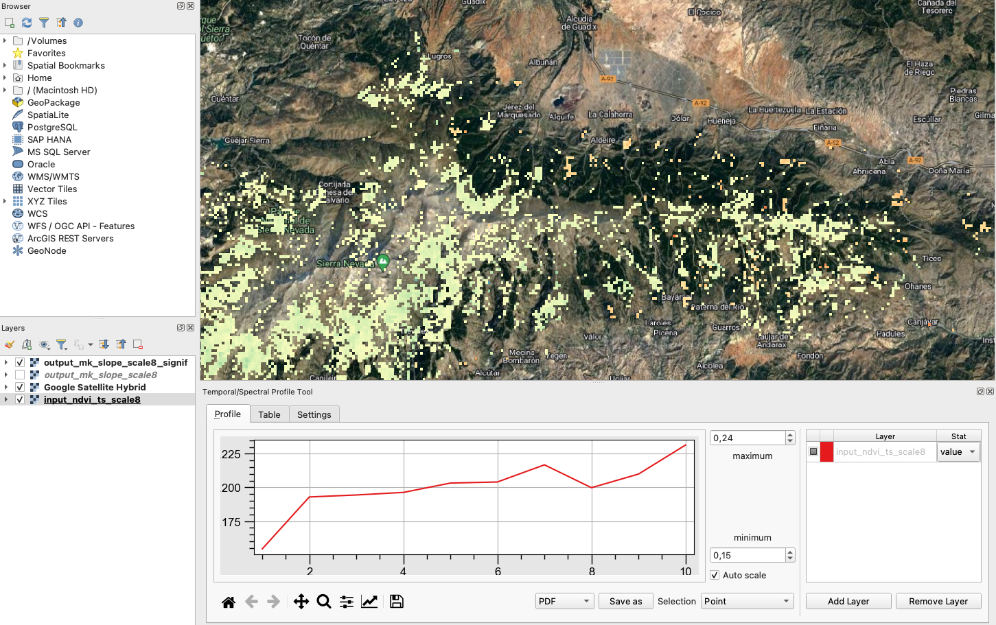
We will build a graph showing the NDVI trend of any selected pixel. In order to do that, follow these steps within QGIS:
- Make sure the
input_ndvi_ts_scale8layer is activated and selected. - Menu Plugins->Profile Tool->Temporal/Spectral Profile
- Click on any pixel of the selected layer and you will see a graph showing its NDVI trend. See image below:
- Make sure the